Uncovering YA Covers: How Dark Are They?
If you followed
, you probably recognize this quote from the article that started it all.
'Hundreds of lurid and dramatic covers stood on the racks before her, and there was, she felt, "nothing, not a thing, that I could imagine giving my daughter. It was all vampires and suicide and self-mutilation, this dark, dark stuff."'
There have been literally hundreds of responses to Gurdon's claims, but aside from a few tweets and my tongue-in-cheek
, no one has really addressed her claim that YA covers are "lurid" and "dark."
Why not?
Because, as it turns out, YA writers and readers kind of agree. A quick Twitter poll revealed lots of common cover complaints, and a cursory glance at any writing forum will produce the same. So I thought-- why not count? I'm unsure how to quantify "lurid," but let's see just how dark (and pink, and girly, and white, and sparkly) YA covers really are. I gathered over 400 covers published by old school houses in 2010.* Then, using some highly scientific Photoshop magic, I discovered...
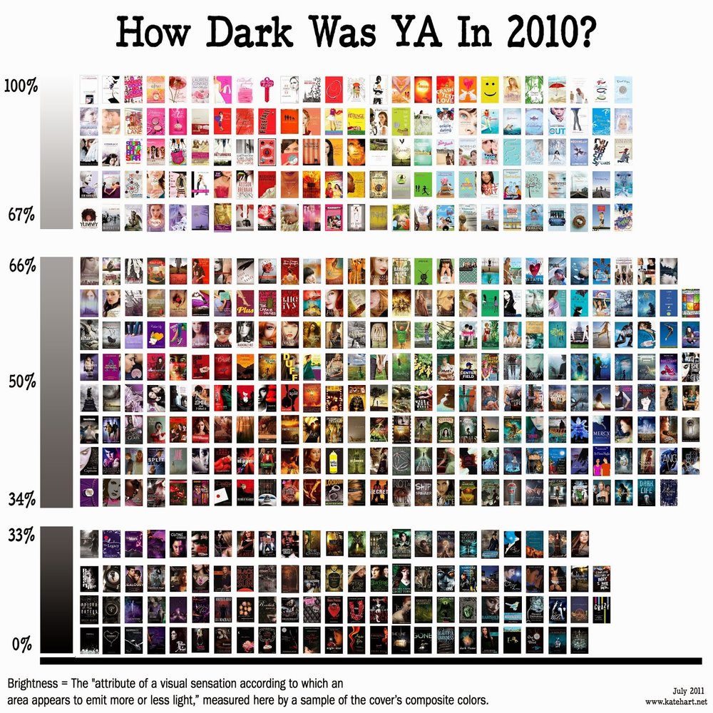
Surprise! Even if you split them down the middle,
there are still more bright covers than dark
.
Now. How much real estate each title gets, if it makes it to the shelf at all, is a different matter. But the fact remains: These covers are out there. The books are available. If you're not finding sufficiently cheery choices at your local store,
try another
. Ask for help. Heck, ask the internet! We can be very helpful, when we're not looking at funny cats or calling out trolls.
At any rate. Another common complaint/observation:
YA covers like to cut people up
. Half a head, a pair of legs, a decapitated body, or an extreme close up of a miraculously pore-less face are all popular designs-- if you get to see the model's face at all. So I counted, and...
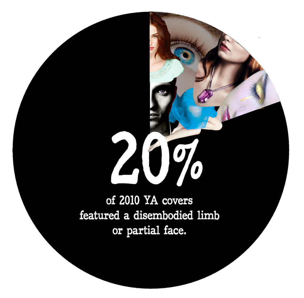

There's nothing inherently light or dark about those stats. In fact, I intended for this post to be a silly look at cover trends. But when I crunched more numbers, I knew we'd have to get serious, because
here's where YA covers are most definitely NOT dark: Race/ethnicity.
It is white girl city out there, folks.
A little explanation of the chart below:
Girls and boys are not mutually exclusive. In other words, a cover with a couple on it would be counted twice, once under white girls and once under white boys.
However, if a cover featured two models of the same gender and different races/ethnicities, I counted it under "multicultural." Those covers are not duplicated in the other categories.
I'm guessing I could eliminate the "open to interpretation" category if I had read every single book represented, but obviously that's impossible. This is also the reason I didn't chart another common complaint: models and settings that don't match the book's story.
My classifications are fairly subjective, since the only way to know a model's ancestry is to ask her and that is, obviously, also impossible.
Even with my likely margin of error, these numbers are horrendous.
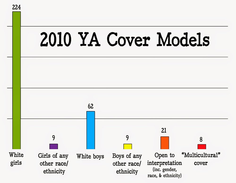
If you combine "other race," "open," and "multicultural," you still only come up with 38 models. That's only 17% of the girls, and if you assume one model per cover, 9% of all covers. Throw the non-white boys in too? That only gets you up to 11% overall.***
I mean, even dead white girls come close to outnumbering obviously black or Asian girls. That's ridiculous. And I like pretty dresses as much as the next person, but seriously? We can't put an Indian or Latina girl in a dress? Really?
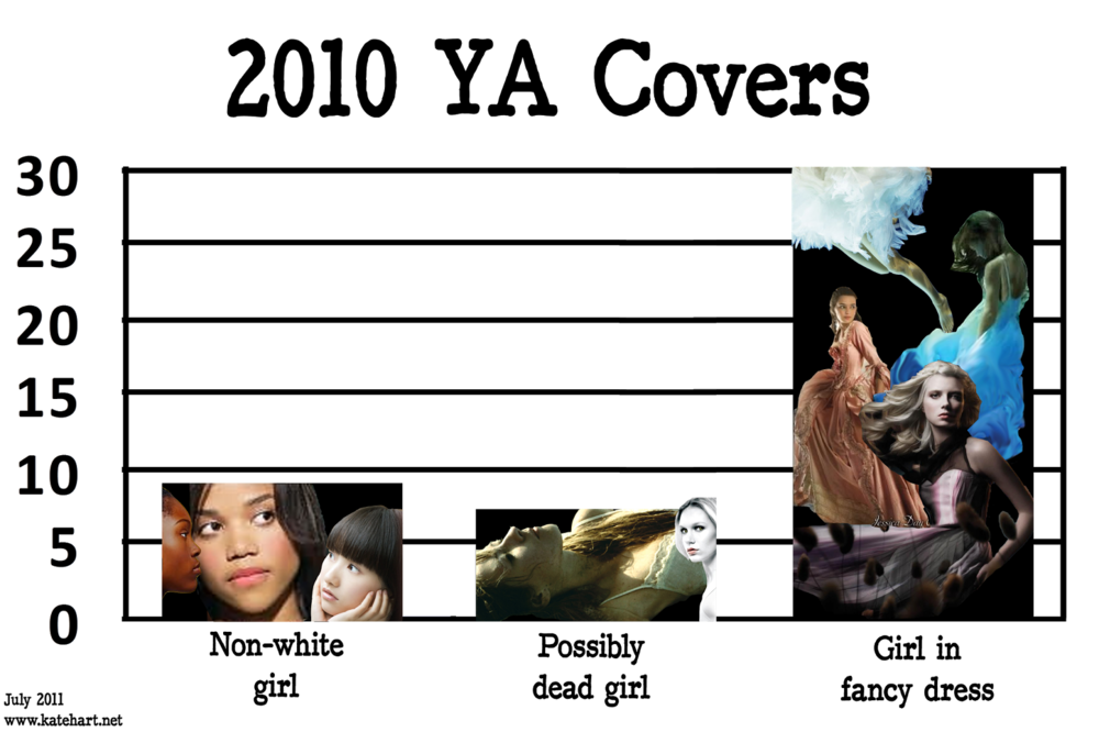
Even
magazine is beating us at inclusion
. Really.
The reasons for this are myriad
(just search on "
" for more discussion)
. It's not the fault of any one publisher or author or marketing department, and posts in the search above have many ideas for changing the situation. But the first step to change is proving there's a problem, and I'd be remiss to exclude these results in the name of keeping this post light.
(That's a pun. A bad one.)
The overall picture here is sobering. Speaking simply in terms of numbers:
YA covers are definitely not all dark-- and they are most definitely white.
Too bad Gurdon didn't throw her weight behind a real issue like this instead.
---
Next week, I'll try to quantify the "girlyness" of YA covers, and see if some other trends (kissing, hands, blood) are really all that common. Do you want to help? There are a few things you could do:
Help me count! "Girly" or "boy-y" is so subjective. Expand the first chart and tally how many you'd include in each category, then leave me your numbers and gender in the comments. (For simplicity's sake, I'm playing along with the idea of binary gender, but I'm aware of transgender issues.)
See any other trends? Know any other stereotypes? Leave them in the comments and I'll see if they're chartable. Thanks!
---
* Nothing against e-books. There are just too many and 400+ cover images in one document was already crashing my computer.
** Thank you, people of Goodreads, for making handy lists of YA books by year.
*** Obviously this is slightly skewed when you count models vs covers, but the gap is big enough that the difference ends up negligible.
**** Disclosures: a) I am the whitest white girl who ever whited. b) I've written 2 books. Both female MCs are white. I'm aware this might make me a hypocrite.
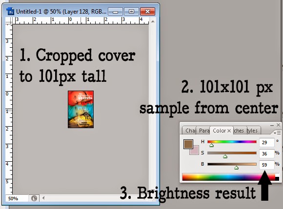
***** I know there are all sorts of scientific ways to calculate brightness, lightness, darkness, and etc., but since Photoshop gives a handy brightness reading, I used that. The largest sample the eyedropper tool will read is 101x101px, so I cropped covers to 101px tall and took a sample from their center.
I'm likely to repeat this experiment with 2011 covers someday, so
if you know a faster way (besides eyeballing it), I will love you forever.